MDX Components
Many Astro sites contain components which are specifically designed for use in MDX content files. Here’s a simple example.
<span class="highlight"><slot /></span>
<style>  .highlight {    background: var(--color-highlight-bg);    padding: 0 8px 4px;  }</style>
Which we might use like this.
This is some <Highlight>text I wanna highlight</Highlight>.We can probably remember how to use a simple component like this, but using more complex components which accept multiple props can often mean opening a code editor and looking at the component file before we can use it.
The MDX Component Builder
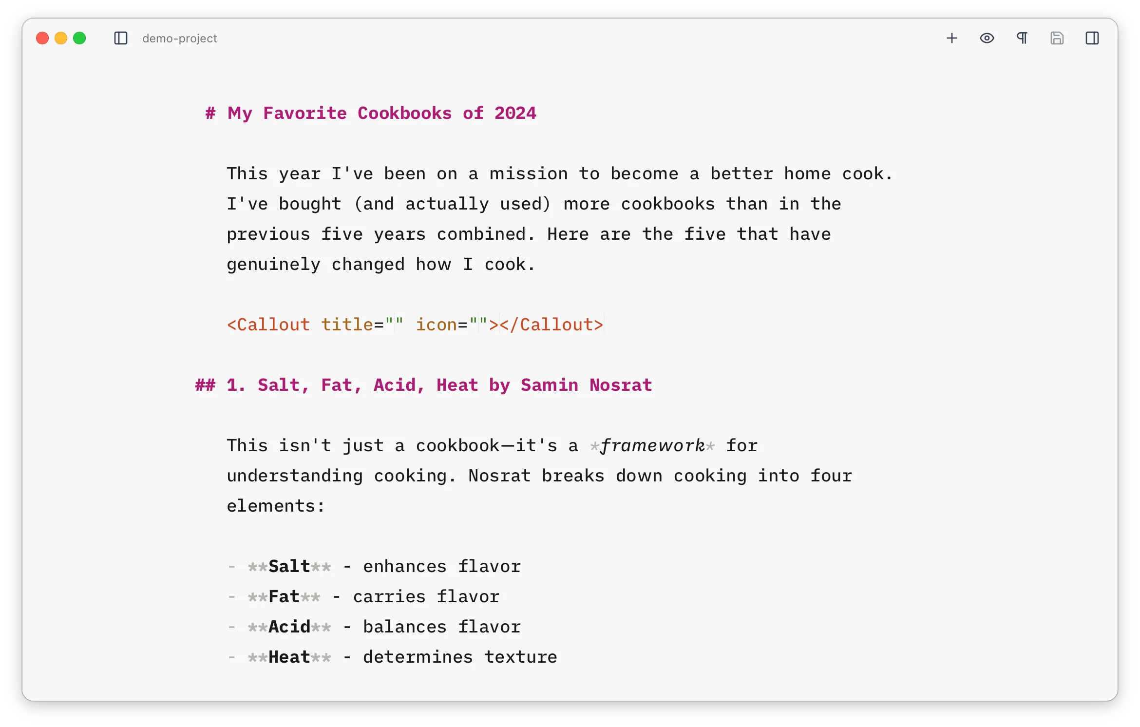
Section titled “The MDX Component Builder”Astro Editor helps with using these kinds of components by providing an interface for searching and inserting them into MDX content files. When editing an MDX file,
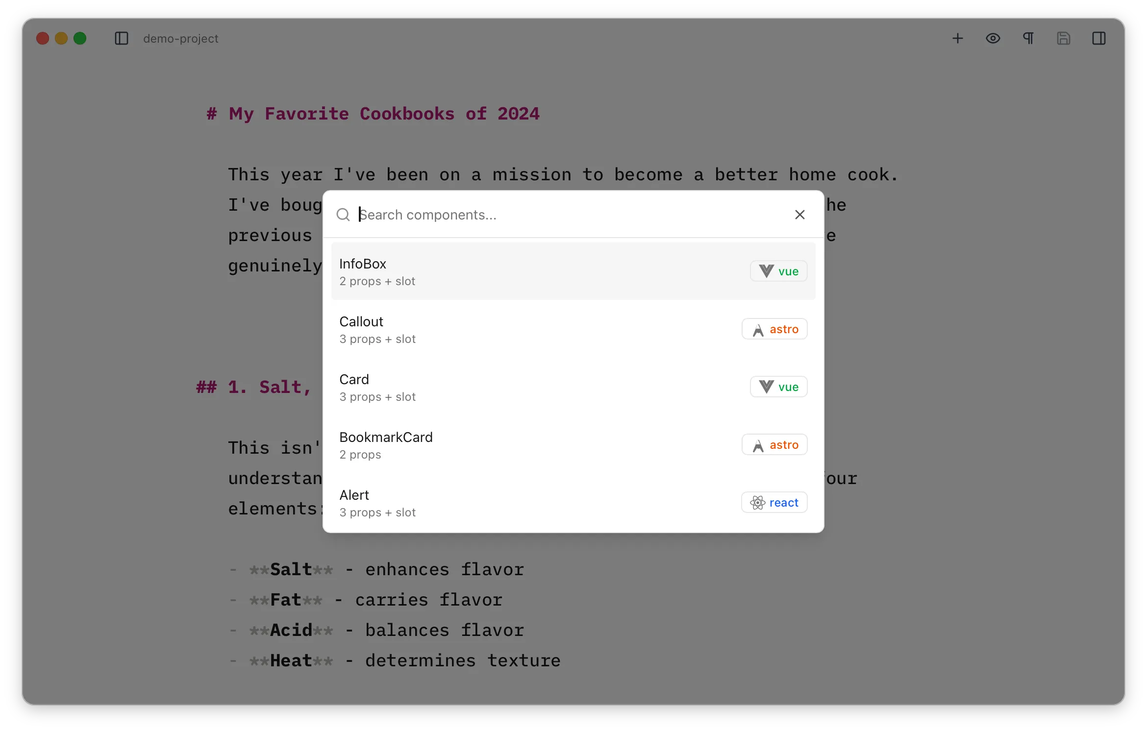
Each entry shows its framework as a coloured badge and a count of its props. If the component has a doc comment above it, a short description is pulled from it and shown under the name (and is searchable too).
Hitting
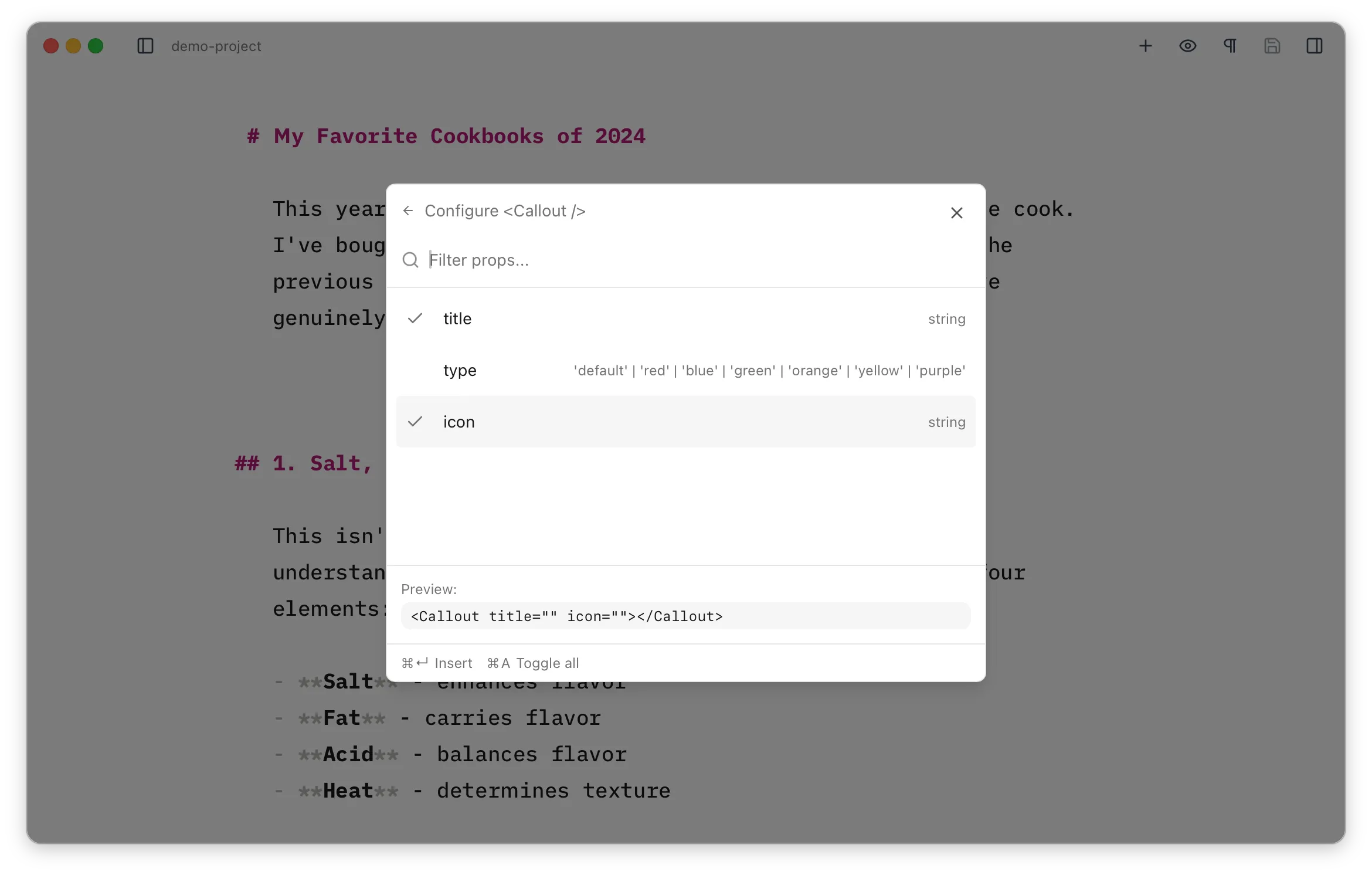
Optional props can be toggled on or off and
For components written in a framework (React, Vue, or Svelte), the configure step also lets you pick a client directive — client:load, client:idle, client:visible, client:media, or client:only. This controls when (and whether) Astro hydrates the component in the browser, and gets added to the inserted tag. client:idle is recommended for most cases. Astro components don’t need one, so the option only appears for framework components.
What are “MDX” Components?
Section titled “What are “MDX” Components?”Any component meant to be used as above. By default, Astro Editor looks in src/components/mdx/ and its subdirectories, but you can configure this in the preferences. The component builder automatically detects which props and slots are available by reading the component’s source code and works with well-formed components written in:
- Astro (
.astrofiles) - React (
.tsx,.jsxfiles) - Vue (
.vuefiles) - Svelte (
.sveltefiles)